
Getting Started
You will need pens (calligraphy felt tips, calligraphy cartridge pens, italic or steel nibs), pencils (i.e. H, HB), ink (if necessary) rubber bands, rulers, erasers, paper, work board.
A good exercise to get the feel of the shapes made by a calligraphy nib is to strap 2 pencils together with a rubber band. Hold the pencils side by side so that the two points represent the outer corners of the pen nib. By moving them sideways, at an angle of roughly 45′, you will draw a fine line and pulling it downwards draws parallel lines – the thick stroke of a pen nib. The arrow shows the direction of the pen nib. This may take some practise but don’t despair.
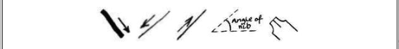
The dip nib is designed to be pulled or moved sideways. If you push the nib upwards you will find it digs into the fibres of the paper and the ink will bleed and spread. You shouldn’t need to apply much pressure to the pen when you write.
Practice Shapes
The shapes below will give you a good idea of how letter shapes are built up. It is the combination of the shapes that make any given letter.
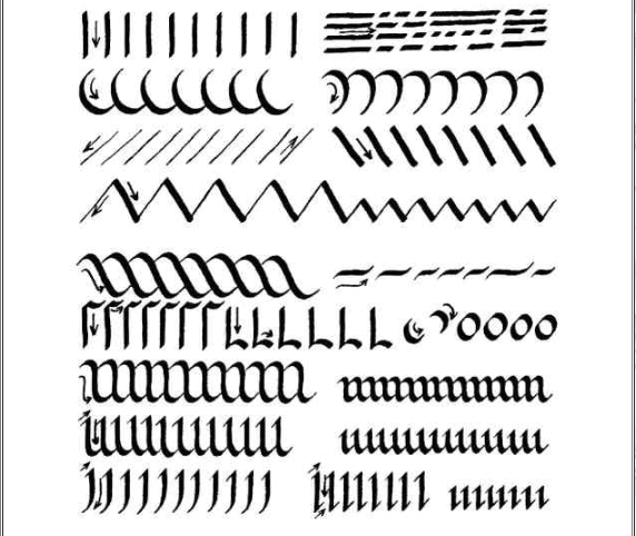
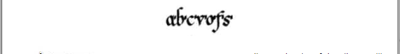
Spot the letters within the shapes. Although these shapes may make any number of letters when combined, you should be able to see the makings of the letters f – l – o – m/n – i/u/w – j – & i in the pen strokes above. Look for the ‘o’ shape within the m/n shapes on the middle line.
Letter Spacing, Line Height & Word Spacing:
By placing a short pen stroke after each letter at its widest point (left) you will get a good idea of how your letters can be spaced. Spaces between letters and words, and between the the pen strokes themselves, are important for a good layout, whether they are uniformly irregular or formally regular.
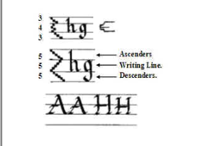
Depending on the size of the nib you will be using your lettering will vary in weight. A guide to finding the size of the lettering is pictured left.
Turn your pen sideways so that the nib is at right angles to the paper. With a series of short strokes measure how high your writing lines are.
By altering the measurement slightly you will also alter the appearance of the letters. Capital letters can reach as high as the top of the ascender line or somewhere in between – it depends on your preference.
Tips:
It is more comfortable to work on a sloping surface than to work flat on a table. Make sure you are comfortable. A good position to work in is with a board resting on your lap and against a table, or at an artists drawing board. You will approach your work from the best angle to remain relaxed in this position.
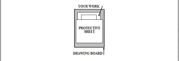
It is a good idea to protect your work with a sheet of paper as you write (see illustration). The grease from your skin can stop the ink from settling properly on the paper. Take a sheet of paper that is bigger than the piece you are working on and lay it on top of your work just under the line you will be writing – about where your hand will rest as you write. As you move down the page, slide the protective sheet down as well.
Set out your tools (pens, pencils, inks, etc) so that they are easily reached. If you are using a dip nib, keep your ink on the same side as your writing hand so that you don’t have to reach across your work to refill the pen – many’s the time I ended up with large blobs of ink on my paper until I learnt to refill away from the writing.
The light needs to be good, preferably daylight, with no shadow cast onto the area you are working on. Alternatively, if you are using artificial light, whether standard bulbs or daylight bulbs, position the lamp to shine on your work so that any shadow falls away from your working hand. If you are right-handed the lamp should be positioned to the left, and in front of, you. If you are left-handed position the lamp on your right. If you are working in daylight then sunlight should ideally be coming from similar directions.
